Guests don't leave your website because your property isn't right for them. They leave because you made them work too hard to find out.
Tímea Pokol
5 min read
You have an inventory.
And there is a fundamental difference between the two that most independent hotel operators never stop to examine.
Open almost any independent hotel website.
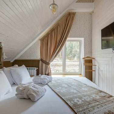
You'll find a rooms page with four to eight room types, each described in square metres and bed configurations. A facilities page listing the pool, the spa, the restaurant, the terrace, the gym. A packages page with three to five bundles that differ mainly by occasion label. A gallery of beautiful photographs. An About page with a story about passion and hospitality.
And then a booking button.
What you won't find — in most cases — is an answer to the question the guest is actually asking when they land on that page.
What should I do?
Not "what do you have." Guests can read a list. The question underneath every browsing session is more specific than that: Given what I'm looking for, what is the right choice for me — and why?
Most hotel websites don't answer this. They present options and wait.
That is not an offer. That is a catalogue.
The distinction matters more than it appears to.
A catalogue transfers the decision-making burden to the guest. It says: here is everything we have, now you figure out what fits.
For a guest who already knows exactly what they want, this works. They'll navigate the rooms page, compare square metres, pick the one that matches their mental picture, and book.
But that guest is not your most valuable guest. That guest is comparison shopping. They're on your website and three others simultaneously. They will book the one with the best price-to-specification ratio.
The guest you actually want — the one who books because your property fits a specific desire they have, who stays longer, who spends more, who comes back — that guest needs something different from your website.
They need to be told what to choose. Not manipulated. Not pushed. Guided.
There is a difference between a website that says here are our rooms and one that says if you're coming to slow down completely, this is the one — here's why, and here's what three days here actually looks like.
The second website is doing the work of an offer. The first is doing the work of an index.
What an offer actually is:
An offer is not a product description. It is not a facilities list. It is not a price point.
An offer is a proposition. It connects what you have to what a specific guest needs — and it makes the fit legible. It tells the guest: this is for you, in this situation, for this reason.
It requires three things to work.
First, a defined guest. Not a demographic. Not "couples and families." A recognisable human situation — the person who has two weeks of accumulated exhaustion and needs to arrive somewhere and be told what to do with themselves. The person planning a significant anniversary who wants the experience to feel considered, not assembled from a menu. The person who wants to explore a region they've never visited and needs the property to function as an anchor, not just a bed.
Second, a clear experience proposition. Not a list of amenities — a description of what actually happens here. What does a guest experience in the first hour after arrival? What does a day here feel like when it's working well? What does the property make possible that wouldn't be possible without it?
Third, a guided path. The website tells the guest what to do next — not as a hard sell, but as an act of hospitality. For guests who want X, we recommend Y. Here's how to book it. Here's what to expect.
This is editorial thinking applied to hospitality. It's the difference between a menu and a recommendation.
Why independent hotels struggle with this:
The catalogue approach is not accidental. It comes from a logic that feels correct: the more we show, the more guests can find what they want. Comprehensive information feels like better service.
But this logic breaks down at the point of decision.
When everything is presented equally — every room type at the same visual weight, every package at the same level of description, every facility listed without hierarchy — nothing is prioritised. And when nothing is prioritised, the guest has to do the prioritisation themselves.
Most guests don't want to do that work. They want to be guests, not researchers.
There's also a fear underneath the catalogue approach. A fear of exclusion. If we design the website around one type of guest or one kind of experience, we'll lose all the others.
This fear is understandable. It is also strategically expensive. A website that tries to speak to everyone ends up resonating with no one. It produces browsing, not booking. It generates enquiries that require significant back-and-forth because the guest didn't understand what they were buying. It attracts guests who arrive with misaligned expectations and leave reviews that reflect the mismatch.
Clarity about who your offer is for does not shrink your market. It sharpens your signal to the guests most likely to book, stay well, and return.
What I find when I audit hotel websites:
The pattern is consistent enough that I now recognise it within the first two minutes on a property website.
The homepage has a strong visual — often genuinely beautiful photography — and a headline that describes the place in atmospheric terms. Tranquil. Authentic. Exclusive. A place apart.
Then the navigation takes you to a rooms page that reads like a specification sheet. Then a facilities page that reads like a brochure. Then a packages page that reads like a discount schedule.
Nowhere on the website does it say: here is the guest this property is designed for, here is what they experience here, here is the choice we recommend.
The atmosphere and the offer are completely disconnected.
The photographs say this is a feeling. The rest of the website says these are the things we have. The guest is left to bridge that gap themselves — to translate the feeling in the photograph into a booking decision from a room type list.
Many of them don't make it. They close the tab and look for a property where the decision is easier.
The question that changes how you see your website:
Read your own website as a guest who has never heard of your property.
Not as an owner who knows every room, every view, every season. As a stranger who has thirty seconds of attention and a specific, unarticulated desire.
Ask: does this website tell me what to do?
Not does it list everything available. Not does it have good photography. Not does it have a booking widget.
Does it tell me — as a specific kind of guest, with a specific kind of need — what the right choice is and why?
If the answer is no, you don't have an offer yet. You have the raw material for one.
The work of turning that raw material into an actual offer is not primarily a design task or a copywriting task. It's a strategic task. It requires knowing which guests you are actually best positioned to serve, what experience you genuinely deliver at your best, and how to make that legible on a page to someone who has never walked through your door.
That work is harder than updating a website. It is also the work that determines whether the website converts.
One thing worth doing this week:
Go to your website. Find the page a guest would land on if they searched for a property like yours.
Count how many choices you present before you make a single recommendation.
If the number is high and the recommendation is absent — that's the gap.
Not in your product. In your offer.
Turning a property's raw assets into a legible, differentiated offer is the first structural task I work on with independent hotels and boutique accommodations. It comes before marketing, before campaigns, before channel strategy. If you recognise this gap in your own website, it's worth examining what's underneath it.
@timeapokol - Experience Portfolio Architecture™


© 2026. All rights reserved.
Tímea Pokol
Tourism Recovery & Strategy Specialist
Strategic tourism consultancy helping accommodation businesses improve revenue performance and experience design.
Company
Contact
Terms & Conditions
Privacy Policy
MarLocker S.L.
C/Honda 1,
04450 Canjáyar
Almería
Spanyolország
NIF: ESB22689137